When it comes to interior design, some colors are timeless staples, while others are fleeting trends. If you’ve been following our blog, you’ve likely read about the power of earthy neutrals, the richness of moss greens, or the simplicity of warm whites and linens. But what about the enduring appeal of blue? As interior design experts and lovers, our designers can assure you, the blue color palette in today’s interior design is a powerhouse of versatility and emotion. It’s a color that consistently delivers, offering a wide range of moods and applications for any space.
The Allure of Blue: A Timeless and Versatile Choice
So, why does blue remain a go-to choice for designers and homeowners alike? Ultimately, the answer lies in its incredible range. Blue is the color of the sky and the sea, which immediately connects us to nature. Consequently, it has a calming, serene effect that can soothe the mind and reduce stress. However, depending on the shade and its application, it can also be dramatic, energetic, and sophisticated. For this reason, blue is a wonderful foundational color that can be used to create a variety of stunning aesthetics, from coastal cottages to contemporary lofts.
Coastal and Mediterranean: Evoking a Sense of Place
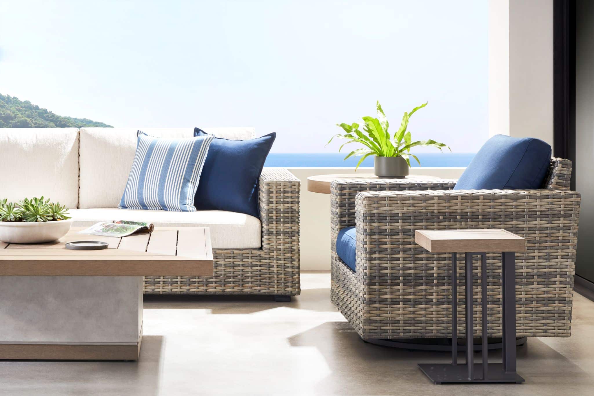
One of the most classic and beloved uses of blue is within the coastal and Mediterranean color stories. These palettes beautifully evoke the feeling of a seaside retreat, regardless of your geographical location. Picture the vibrant, sun-drenched blues of the Greek islands or the serene, watery tones of a New England beach house. These hues, when paired with crisp whites and sandy tones, instantly transport us to a place of relaxation and warmth. You can easily bring this coastal vibe into your own home, even in a landlocked state like Iowa.
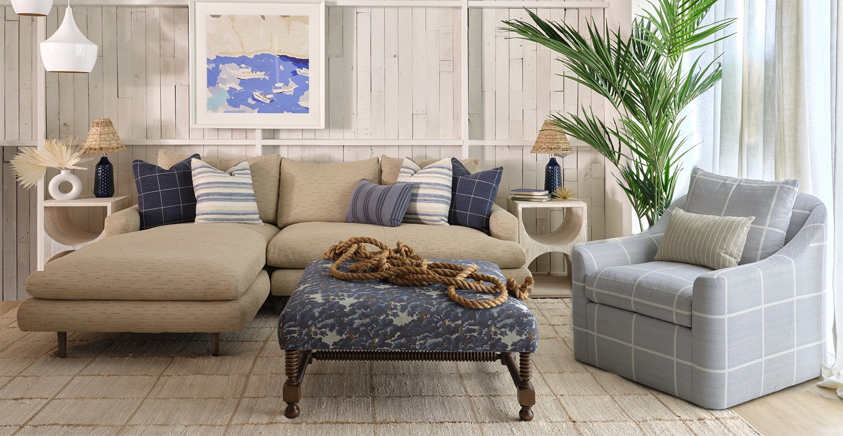
For instance, consider a combination like the Somerset sectional, which provides a comfortable, neutral base. Then, you can introduce splashes of blue through elements like the Essex ottoman and the Kensington chair. Finally, you can add an array of throw pillows in varying shades of blue, from deep navy to soft sky blue. This layering creates a dynamic yet harmonious atmosphere that feels both airy and grounded. This specific application of the blue color palette in today’s interior design speaks to our innate love of warm days and tropical nights.
Blue in the Organic and Contemporary Space
While blue is traditionally associated with coastal themes, it also works remarkably well in modern, organic interiors. Today’s design trends often favor a connection to nature, featuring rich wood tones, raw textures, and a mix of materials. In these spaces, blue acts as a powerful counterbalance, providing a vivid splash of color and life that truly enhances the richness of the wood and the warmth of the neutrals. A deep, saturated blue can make a room feel more grounded and intentional.
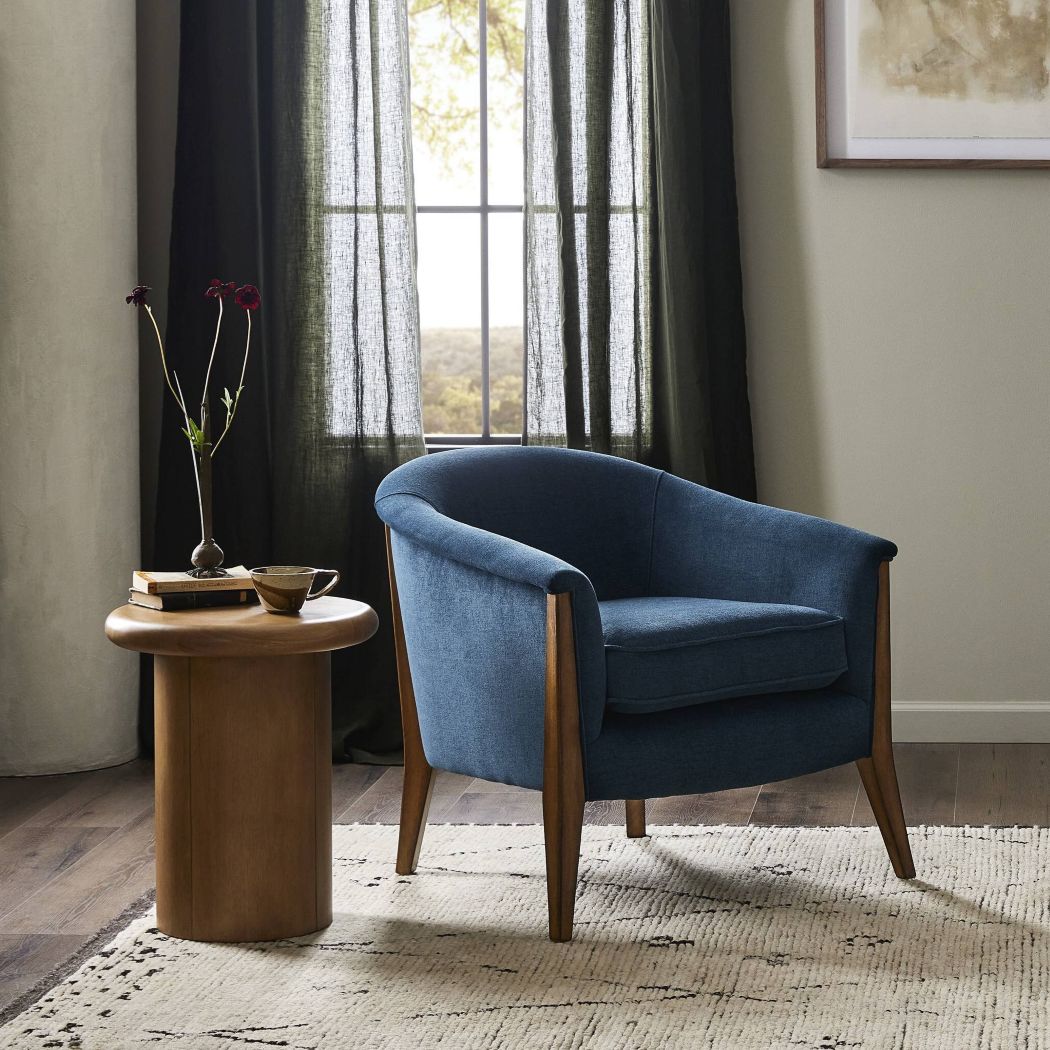
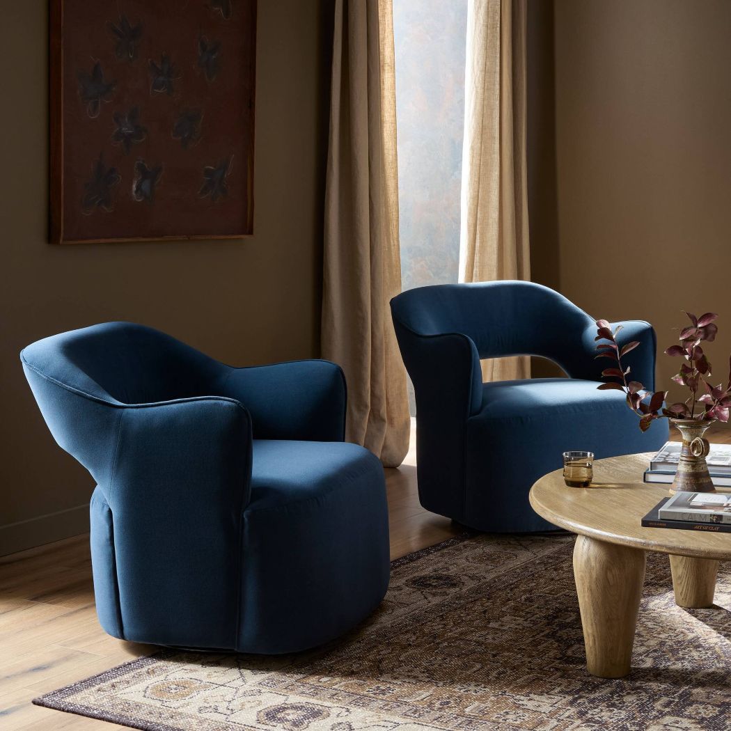
Imagine a living room with an organic modern aesthetic: a live-edge wood coffee table, a jute rug, and cream-colored furniture. Now, introduce a bold cobalt blue armchair or a collection of indigo-dyed pillows. The blue acts as a focal point, drawing the eye and adding a layer of visual interest that prevents the room from feeling monotonous. In this context, blue isn’t just a color; it’s a statement.
The New Classics: A Sophisticated Blend of Tradition and Modernity
For those who love the “New Classics” look—where you blend modern scale and comfort with touches of upscale luxury—blue is your ultimate playground. This style is all about creating a sense of timeless elegance without feeling stuffy or overly formal. Here, a deep, rich blue can be used to create a truly dramatic and sophisticated backdrop.
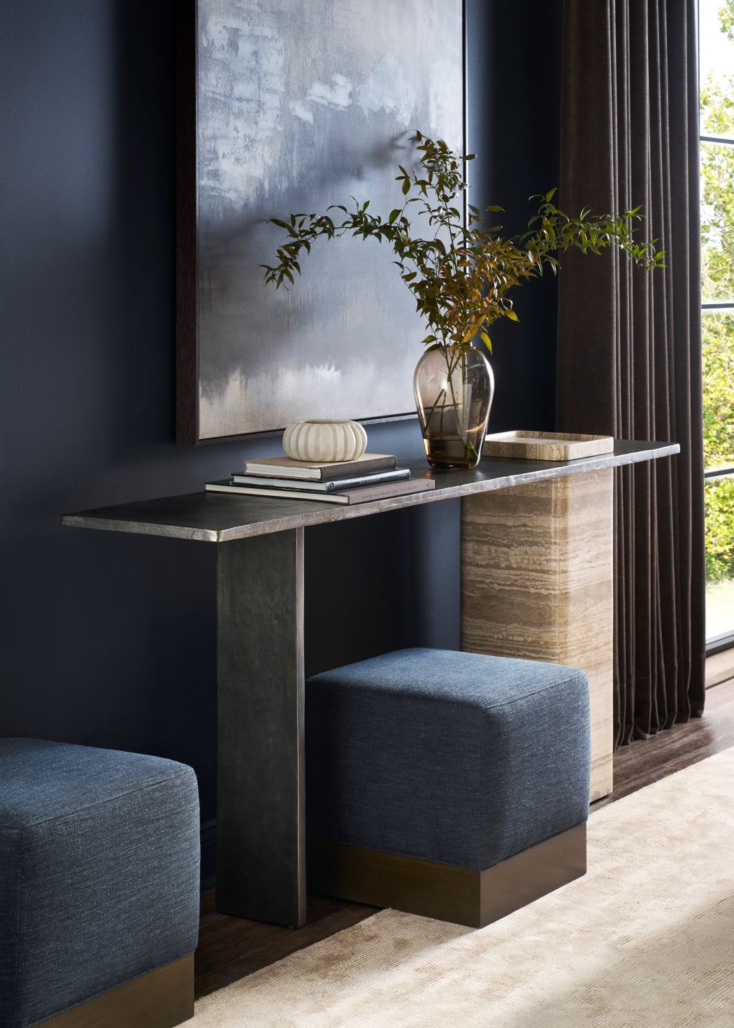
Picture a room with classic architectural details—think crown molding or wainscoting—but with contemporary furnishings. One of my favorite examples of this is a designer who used deep blue walls, creating a jewel-box effect. To further emphasize this, they added a pair of stunning blue velvet ottomans. The result is a truly “wow” look that feels both luxurious and inviting. Furthermore, a lighter, calmer shade of blue can serve as a serene foundation, creating a blank slate for you to introduce other colors and textures.
Finding the Right Shade and Application
Ultimately, the key to using blue successfully is to consider the mood you want to create and the light in your space. Lighter blues, such as powder blue or cerulean, are often calming and can make a small room feel larger and more open. Conversely, darker blues, like navy or midnight, can create a sense of intimacy and drama, making a large room feel cozier and more grounded.
Our goal at BY DESIGN is to discover your personal design style. Therefore, we always tell our clients that there is no single “right” way to use color. It’s about personal expression and creating a space that makes you feel good. So, if you love blue, then we should absolutely go for it. We will have no trouble creating a room that you not only love but that also feels like a true reflection of your personality. And if you need help finding the perfect shade or application, our professional designers at BY DESIGN are always ready to help you navigate the endless possibilities. Get in Touch Today!
You might also enjoy these BD posts: